A new brand identity for a historic company


Valli&Valli evolves and looks to the future with a strategic rebranding that has involved many aspects and nuances in brand communication.
The rebranding, entrusted to the Milan agency Leftloft, was designed to make the brand's communication tools, founded in 1934 by Pasquale Valli with the idea of transforming a simple functional mechanism such as a handle into a small work of domestic art, more fluid and up-to-date.
Goals
The new formal and conceptual outfit with which Valli presents itself to the public was created with the objective of defining a more agile and contemporary expressive and communicative lexicon, accentuating the corpus of the company's aesthetic and productive values in order to reposition Valli within the international design imagination and promote it as the first choice of architects and designers.
The rebranding activity also aims to dialogue with the end consumer through the company's digital and social channels.
Naming and payoff
With a view to enhancing the Valli&Valli brand with greater sensitivity, making it more contemporary and recognisable, the rebranding intervened first of all at the naming and payoff level.
The most important choice was to reduce the redundancy present in the name, moving from the doubling of Valli&Valli to a simpler and more immediate Valli, in an essential and affirmative declaration of identity.
The handle creators payoff, on the other hand, emphasises the ideational and demiurgic character of the production, emphasising both the formal and material dimensions in the handle design.
Brand Architecture
The brand architecture has also been completely reorganised and rationalised, defining two precise and distinct collections for Valli: Fusital and Lab.
Fusital is the élite-collection that groups all the brand's most prestigious handles, those in which boldness of style and care for aesthetics are manifest. Founded in 1976, Fusital marked the company's opening to the universe of design and creativity. Today, Fusital handles bear the signatures of some of the greatest personalities in contemporary design and architecture.
Lab is Valli's new collection and groups together handles conceived and designed entirely in-house in its ateliers and research and development laboratories. Its name evokes the brand's operational dimension, projected towards the future, the constant ergonomic refinement, the evolution of working techniques, the experimentation of new approaches and new materials.
Visual identity
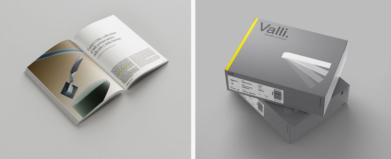
The new logo designed for the rebranding is a reinterpretation of the previous one, of which it updates the modernist style. The font remains a very clean and readable sans serif: the two Ls of the Valli logotype, slightly modified, are an allusive and formal reference to the shape of the handle and recur as a stylised and independent graphic element also in the graphics of catalogues and communication materials. The dot placed after the name emphasises a break with the past and adds authority and identity to the brand.
The colour palette selected for the new look is neutral and elegant, with a base of cool grey tones. Yellow is used as a signature and harks back to the graphics developed by Bob Noorda for Valli in the 1980s.
The impact of the rebranding also affected the aesthetics and functionality of the digital communication channels: social, website and newsletter.


